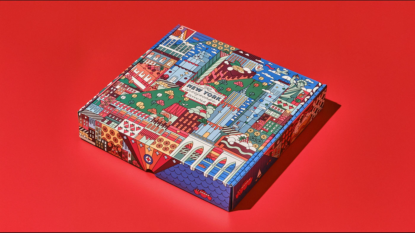
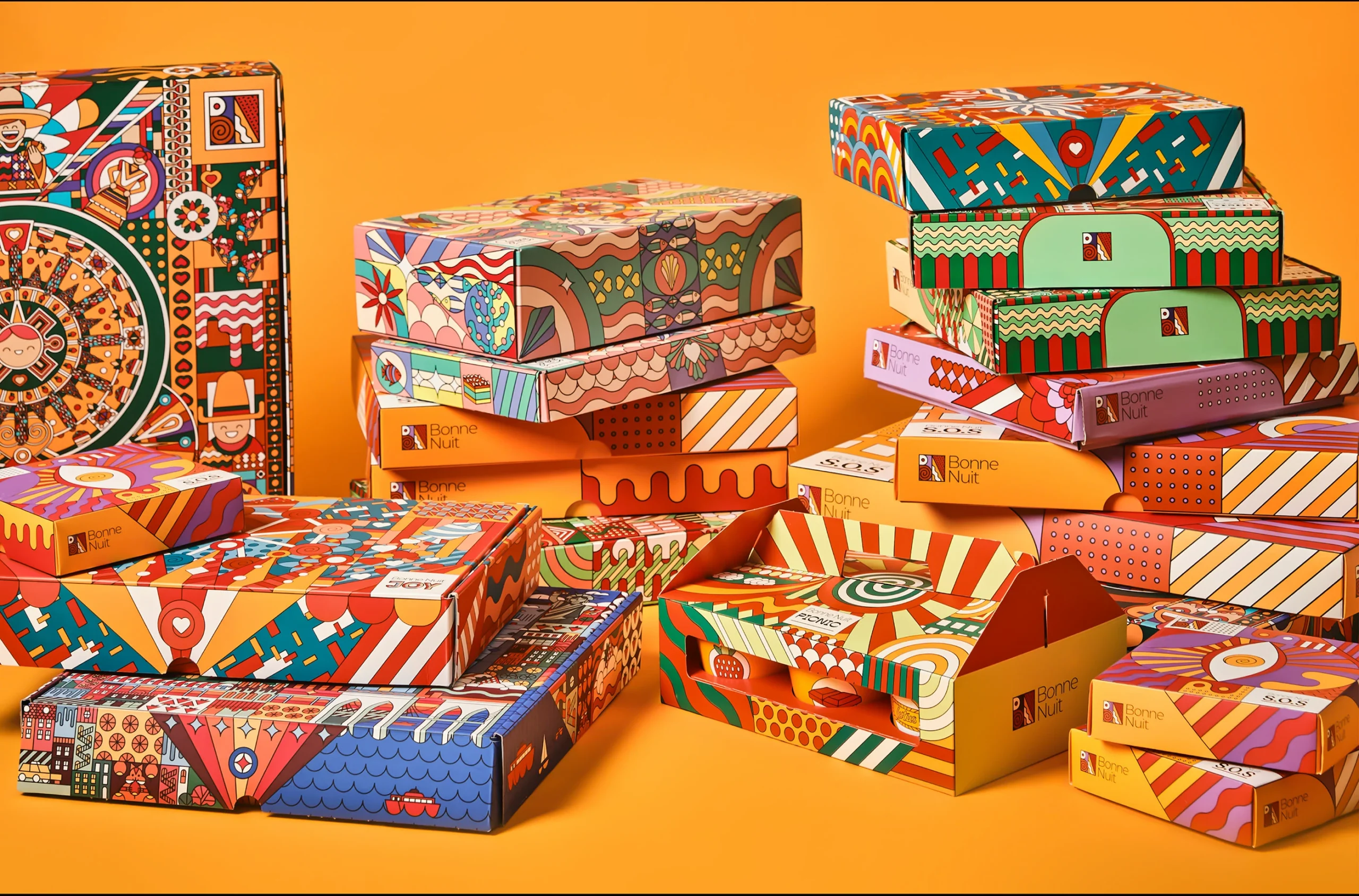
Our solution centered on a “Joyful Mosaic” concept, utilizing a rich palette of bright, complementary colors and a dynamic, illustrative style. We developed a series of custom patterns and motifs, each telling a small story, that could be mixed and matched across the different packaging formats.
Color Palette: The primary colorsincluding vibrant oranges, reds, blues, greens, and yellows—were chosen to create an immediate sense of energy and happiness. The use of both warm and cool tones ensures visual balance and depth.
Illustrative Style: The core of the identity is a whimsical, hand-drawn illustration style. Intricate patterns, stylized characters, and geometric shapes are combined to create a unique and memorable aesthetic.
This approach gives the packaging a collectible, artisanal quality. Packaging Structure: A modular packaging system was designed to accommodate various product configurations.
The boxes feature different sizes and shapes from small cubes to larger rectangular and cylindrical forms allowing for a flexible product line. The structural design, with its visible folds and seams, adds to the handcrafted feel. The use of a repeating brand logomark on the sides of the boxes provides consistency and reinforces brand recognition.